As an engineering team, we have spent the last 12 years building and scaling massive enterprise SaaS products like Worksuite. Over more than a decade of pushing production code, our developers consistently ran into a frustrating roadblock when spinning up new marketing pages, micro-sites, and application dashboards.
We were forced to choose between two sub-optimal paths:
Create intricate Canvas maths, Framer Motion animations, and contemporary layout grids by hand over the course of several engineering hours.
Install heavy, opinionated component libraries via package managers, which immediately locked us into their rigid design structures, bloated our JavaScript bundles, and broke every time a major framework updated.
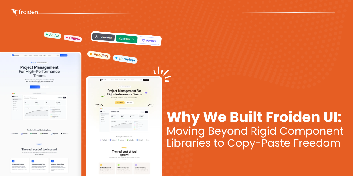
We knew there had to be a better way for engineering teams to build modern, hyper-polished interfaces. That is why we built Froiden UI—a zero-dependency, animation-first, copy-and-paste design repository curated for teams who need to ship beautiful websites at maximum velocity.
Here is a look behind the curtain at why we built Froiden UI, how it fundamentally shifts frontend development efficiency, and how your team can adopt it to optimize your engineering workflows.
The Paradigm Shift: Why Copy-and-Paste Wins Over Package Installation
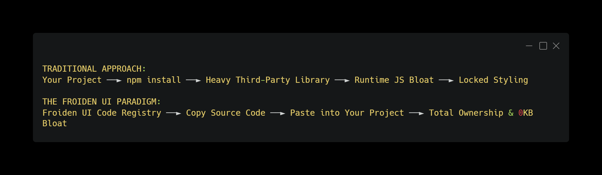
For years, the standard approach to UI development was simple: npm install dependency-name. While this works well for foundational backend utilities, it creates massive technical debt on the visual frontend layer.
Traditional runtime UI libraries process component styles dynamically in the browser, adding significant performance overhead. Furthermore, being tied to a third-party package version means your layout styling can break unexpectedly during routine framework updates.
Froiden UI operates on a headless, build-time utility model. Instead of installing a massive registry package, your developers select the exact component they need, copy the raw source code, and paste it directly into your local repository.
The Architectural Benefits for Engineering Teams:
Zero Package Bloat: Your final production bundles only include the atomic Tailwind utility classes used at build time, keeping your application light and fast.
Complete Code Ownership: Once you paste a component into your workspace, it is yours. Your team can customize the underlying logic, extend functionality, and tweak styling without fighting proprietary library constraints.
Future-Proof Code: Because there are no external package version locks, dependency-related upgrade risks are significantly reduced because components live directly in your codebase or transition to Tailwind CSS v4.
Exploring the Product Ecosystem
Froiden UI is split into distinct categories designed to support both core application development and high-converting marketing pages.
1. The Core UI Kit (37+ Production Primitives)
We didn't want Froiden UI to just be a collection of flashy landing page decorations. We built a comprehensive UI kit featuring 37+ essential interface primitives—including structural sidebars, tables, accordions, and navigation systems. Your team can use these layouts as a reliable baseline for entire SaaS dashboards without needing a secondary component library.
2. High-Performance Interactive Components
To capture user attention, modern websites need subtle, engaging micro-interactions. We engineered a series of premium components optimized specifically for the browser's GPU:
Canvas & Matrix Backgrounds: Features like our Aurora meshes and floating particle fields use the HTML5 Canvas API to render rich visuals directly on the GPU, maintaining a smooth 60 frames per second (FPS) without overloading the DOM.
Kinetic Text FX: Native typewriter tracking, letter-scrambling arrays, and viewport scroll-highlight tools designed to boost landing page engagement.
Advanced Input Fields: Secure OTP verification blocks and smooth hold-to-confirm progress buttons ready for seamless form integration.
3. Native HTML & React Hybrid Support
Unlike libraries locked exclusively into specific frameworks, every component in Froiden UI includes a native vanilla HTML version alongside the React source. This means your engineering teams can maintain visual consistency across your entire product ecosystem, whether they are building a Next.js application, an Astro static site, or a custom CMS theme.
Implementation Blueprint: Launching with Froiden UI
Integrating Froiden UI components into an enterprise workflow is straightforward. Let's look at a practical integration example using a Next.js App Router workspace coupled with Tailwind CSS to build a highly responsive, cursor-tracking feature card block.
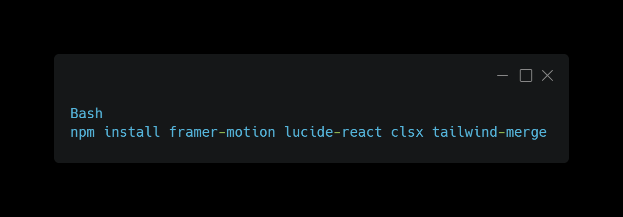
Step 1: Install Peer Dependencies
Because Froiden UI uses copy-and-paste code snippets, you only need to install standard industry-standard motion design packages once in your project root:
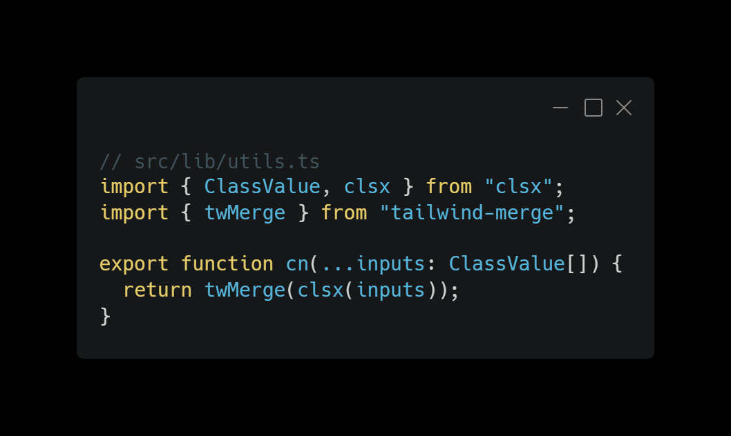
Step 2: Configure Your Style Utility Merger
Our components leverage a standard layout helper utility to cleanly combine conditional Tailwind CSS classes. Save this helper inside your local configuration directory (e.g., src/lib/utils.ts):
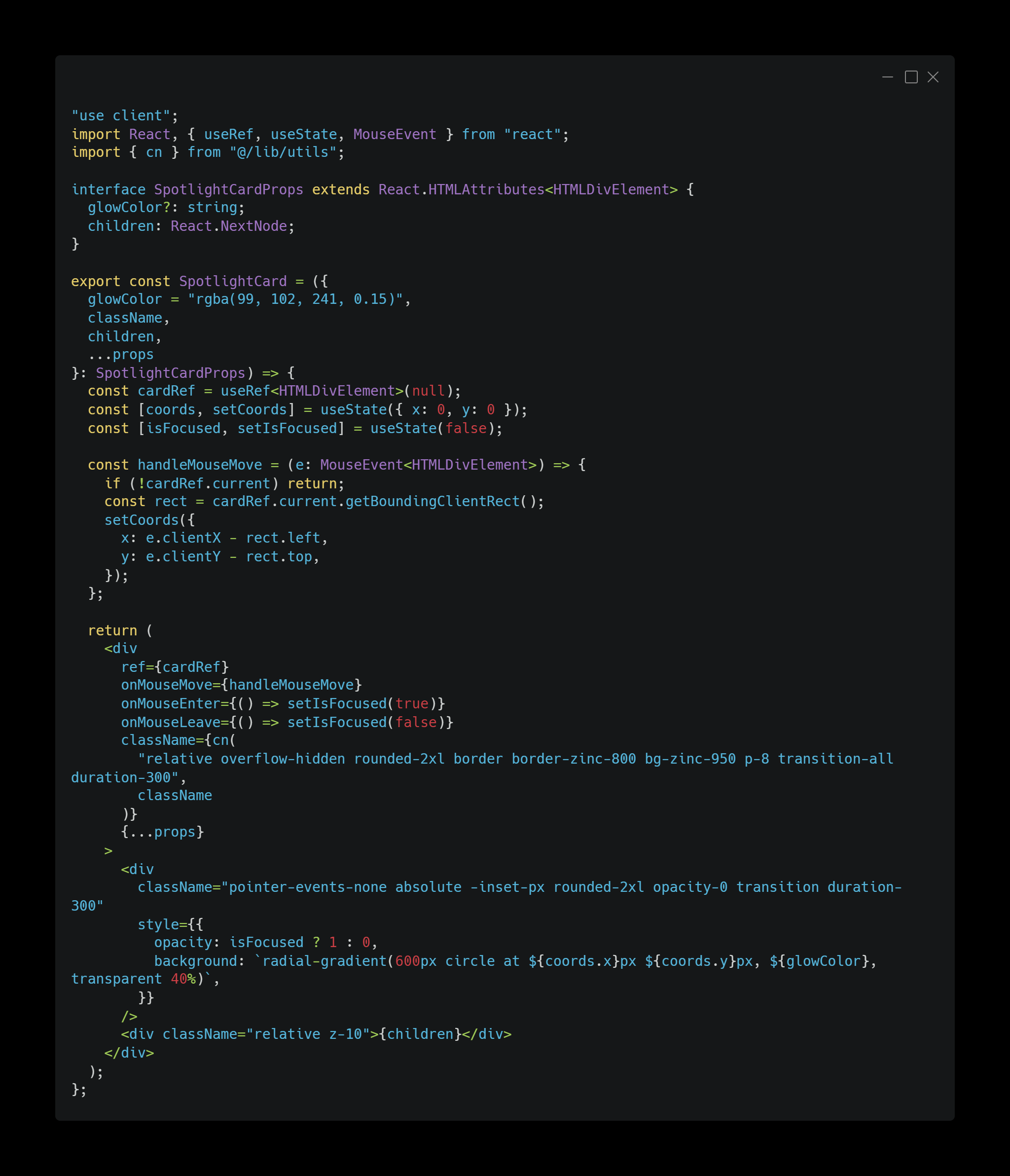
Step 3: Copy & Paste the Component
Next, grab the raw implementation code for the SpotlightCard from the Froiden UI registry and drop it directly into your project's component folder (src/components/froiden/SpotlightCard.tsx):
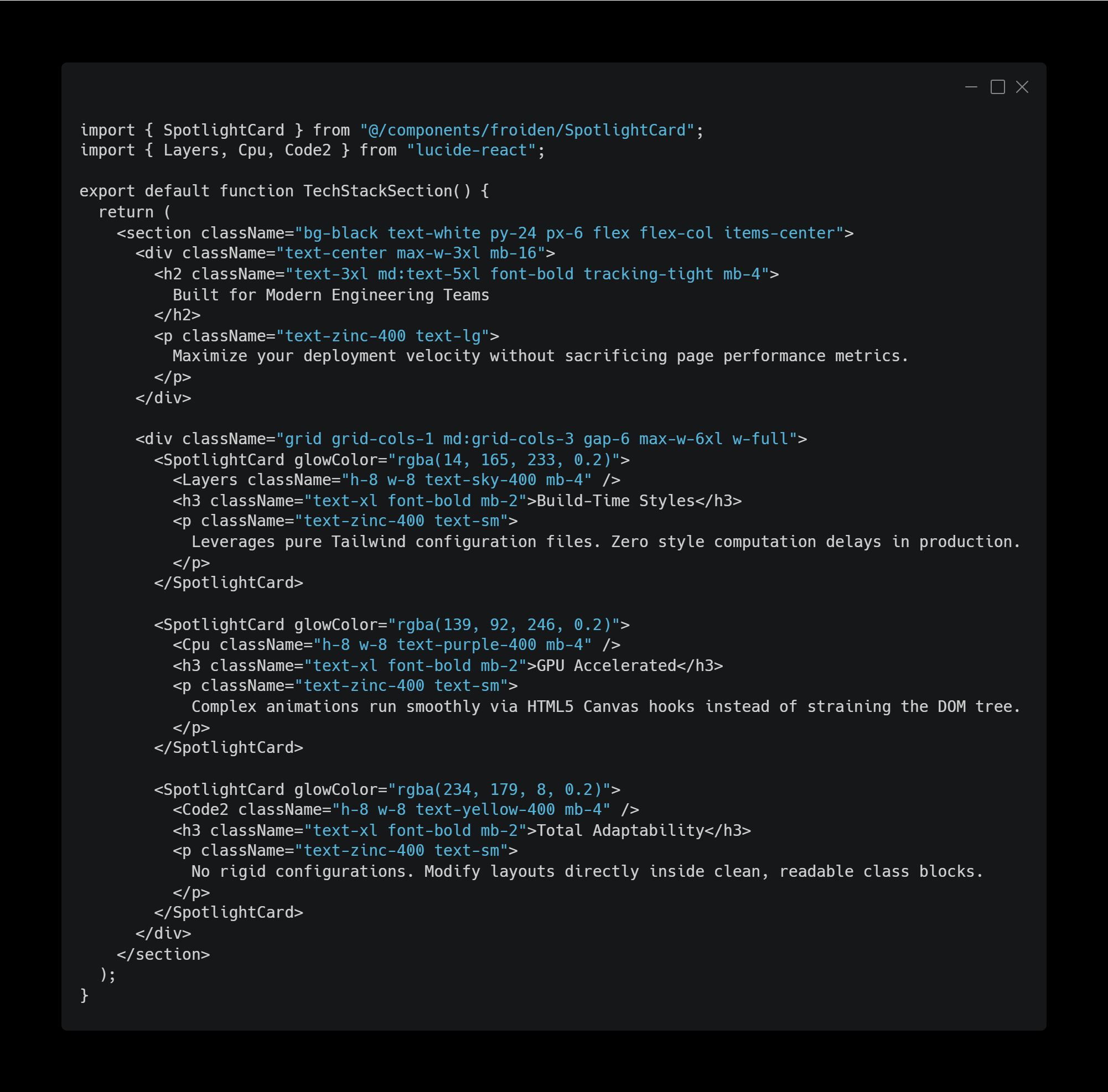
Step 4: Deploy Inside Your View Layer
Now, your developers can import the new component directly into any page routing view layer (src/app/page.tsx):
Engineering Best Practices: Maximising Visual Performance
To help your team get the absolute most out of Froiden UI, we recommend adopting these production guidelines:
Isolate Interactivity and Hydration
When developing within modern server-first architectures like Next.js App Router or Remix, keep your parent page layouts as React Server Components (RSCs). Only mark specific interactive components with the "use client" directive. This ensures your primary content processes immediately on the server for maximum SEO authority, while smaller client-side components handle interactions once in the browser.
Consolidate Active Background Elements
Our Canvas-driven particle and matrix fields are highly optimised, but running multiple background renders simultaneously in the same viewport can cause performance lag on older mobile devices. Use one clean background component per viewport section to keep frame rates steady.
Streamline Styling Changes with Global Tokens
Because Froiden UI relies on native Tailwind classes, you can manage global themes across your entire UI library using your central tailwind.config.js or standard CSS design variables. You won’t have to hunt through obscure configuration APIs just to change a theme color.
Elevating Your Development Standards
Froiden UI was built out of our own need for a component library that respects developers as true engineers. By moving away from restrictive package installations and embracing clean, copy-and-paste source code, we have unlocked a much faster, more flexible workflow for our team—and now, your team can too.
We invite you to explore our growing catalogue of production-ready components and full-page SaaS template bundles. Let's build faster, eliminate unnecessary bundle bloat, and ship interfaces your users will love. https://ui.froiden.com/